Simplicity in UI for Complex Features - Where most Browsers go wrong!
Traditionally, most browsers fall in two camps. Either, they are simple windows to the web with basic tab and bookmark management features, or they are power user tools that offer tab groupings, split screens, and other features meant to entice the advanced users who demand more of their browsers.
Chrome, Edge, Firefox, Safari - i.e. most popular mainstream browsers fall in the former camp, while the lesser known alternatives like Vivaldi, Opera, Arc Browser etc fall in the latter camp.
The challenge for the latter camp is how to offer these power user features and yet deliver them with a UX that will not alienate the mainstream undemanding users so they can grow their user base. And this is where they all fall flat on their faces. The tiny buttons for a browser meant to be used with touch screens, tabs that change behavior when using with split screens, rows and rows of important user settings hidden in numerous panels, standard features that now do less or disappear when turning on another feature, the list goes on.
Arc Browser is one of the notable exceptions as they have made significant efforts to sidestep these issues by rethinking the browser experiences from the ground up and developing a new architecture to support these features. But even so it still feels challenging to adopt as it asks the users to adopt this new way of browsing and give up a lot of their old ways. Only time will tell if it will someday become the mainstream way of how users expect to browse the web but so far the signs are encouraging.
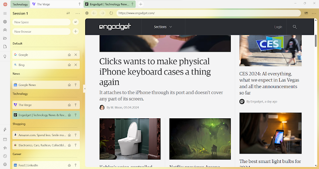
One of the main tenets of building My Session was to think about each power user feature through the lens of a novice user who just wanted a basic window to the web. This meant introducing side tabs without it replacing or taking away the ease of use of the traditional horizontal tabs, adding split screen functionality that was more flexible and adaptable than any other browser without it feeling shoehorned in and forcing users to relearn what an active tab does, adding tablet mode functionality without making it harder to navigate on a traditional laptop or desktop, adding screenshots for bookmarks without changing the user experience of adding bookmarks, adding the ability to explore local files and folders without it feeling any less of a capable browser and weaving the file explorer functionalities seamlessly in the web browsing paradigm and on and on.
These hard choices and hours of careful considerations that have gone into the smallest of each feature have made My Session what it is today, where users are willing to pay a one-time fee to purchase a browser, when so many great free options exist. Its because the users feel valued, and their experiences and ways of working feel accounted for, and powerful features are made available to them with due respect to their workflows.
Try it today and let us know if we have missed the mark anywhere and if there is anything we can do make your browsing experience even better. You deserve it!

Comments